|
ART
DECO HOTEL LUGGAGE LABELS
by
JOAO-MANUEL MIMOSO
|
| 1- ORIGINS |
|
|
. |
|
|
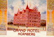
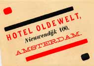
| Not
all Art Nouveau design and graphics were based on the languid curves lines
that some considered decadent. Some trends within the Art Nouveau movement
favored elongated and predominantly rectilinear forms as seen in the decoration
of the label at left. |
|
| . |
|
| |
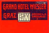
By
1905 Austrian artists of the Wiener Werkstätte were using wholly geometrical
and often linear graphic solutions of great originality and strength. They
are classified within the Art Nouveau movement but most of their industrial
design, architectural- and art work of, say, 1908 would not seem out of
place twenty years in the future. It is to the everlasting credit of the
Austrian genius that Wiener Werkstätte labels, like the one at right,
are only datable within a 20-year uncertainty period. |
|
|
. |
|
Art Nouveau practitioners recognized that, although the flowing lines of
their style adapted well to the forms of Nature, the linear and geometric
shapes of industrial products such as trains and cars could not be properly
rendered and were thus best avoided as a main subject or decoration theme.
However, others were finding inspiration in those complex machines made
of simple geometrical forms. |
|
| . |
|
| |
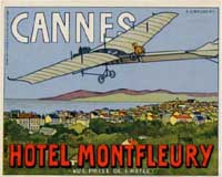
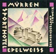
The
so-called machine-aesthetic is not an art movement but rather a denomination
including design of all kinds that accepts the sound geometrical principles
of machine-made products and adapts all its elements to the primacy of such
shapes. The image used in the label at top left dates from circa 1909, while
the label at right probably dates from around 1914. Both exemplify the clean
machine-aesthetic in the rendering of architectural elements and the lettering. |
| |
|
. |
| 2- THE AVANT-GARDE
MOVEMENTS |
|
|
. |
|
|
| The
vitality of Art at any given period might well be measured by the number
of avant-garde movements: people with new, often cranky-sounding ideas that
eventually find acceptance. One such movement was Italian Futurism, started
by F. Marinetti in 1909 as a revolution that advocated typography as art
and proposed disharmony through the use of up to twenty fonts in three or
more colors in any one page. From 1919 the Bauhaus produced examples that
were inspired on those and other principles. Bauhaus graphics made use of
several different font types and simple geometric forms, often in black
and red, as in the label at left. |
|
| . |
|
| |
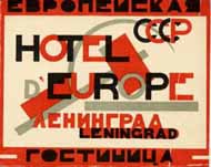
Another
avant-garde movement that also influenced Bauhaus graphics was Russian Constructivism.
First stated shortly before the October Revolution, the movement's nonfigurative
visual vocabulary relied on brightly colored (often angular ) shapes, bold
lettering and collage designs. Communist in inspiration, the constructivists
were nonetheless soon eyed with suspicion by the Soviets. Its short life
in a country in turmoil makes true constructivist designs some of the rarest
and most desirable of all hotel labels. |
|
|
. |
| The
origins of Cubism are still earlier than those of Futurism, being
traceable to experiments in color and shape started by Picasso and Braque
in 1906. Pure Cubism aimed at conveying the essence of objects through a
perspective of geometric shapes and was averse to an excess of color. Cubist
hotel labels, like the one at left, are very unusual. |
|
| . |
|
|
| 3- THE HEYDAY
OF ART DECO |
| |
|
. |
|
| |
Plain
Art Deco was a global style that flourished between wars and was characterized,
in its graphic avatar, by an overall preference for simple and often striking
geometrical shapes, elongated figures and objects, bright contrasting colors
and special, usually non-seriffed typefaces (serifs are the small marks
on the tops and bottoms of types as found on classical fonts like Times
New Roman that browsers use as default, but not on Helvetica in
which this text is written). |
 |
. |
| The
name Art Deco was coined in the 1960s after the 1925 Paris International
Exhibition (Exposition Internationale Des Arts Decoratifs
et Industriels Modernes). In its heyday it was known simply as the Style
Moderne. Thanks to its bold rectilinear forms, Art Deco easily integrated
cars, planes and other technological symbols of the modern world. The futuristic
shapes and colors also conveyed the optimism of the 1920s, when its popularity
peaked. |
|
| . |
|
| |
The
homeland of Art Deco is often said to be France. This statement is based
on the fact that the style triumphed at the 1925 Paris Exhibition and through
it received a wider recognition than ever before. However its roots stemmed
from many countries: not only France, but Austria, Germany, Scotland, Belgium,
Russia, (...), and particularly Italy can claim fair shares of credit. |
|
|
. |
| An
important source of the individuality of the superb Italian Deco was Futurism,
briefly mentioned above. In his manifestos Marinetti advocated an uncanny
mix of Italian nationalism, militarism, and 'the new religion of speed',
as expressed through cars and airplanes. From typography Futurism spread
to other fields of graphism and after some "taming" that did away
with its most extreme propositions and hybridizing with other deco trends
it came to be the graphic style of Mussolini's Italy. |
|
| . |
|
| |
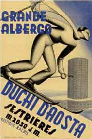
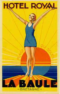
Futurism-inspired Italian Deco
uses characteristic hand-drawn lettering, often with several fonts of
different colors to the page.
Another distinguishing characteristic of typical Italian designs is the
widespread use of the airbrush grading of colors into white, as illustrated
by some of the most representative labels of the period. The very best
designs, often wasted in such trivial items as chocolate wrappings, covers
for minor magazines, or calendars, are as strikingly fresh and attractive
today as they must have been in their time. The
label at right is characteristic of Italian Deco. There are at least four
different fonts in three colors; some of the text is at an angle with
the rest. The color of the elongated skier was airbrushed.
|
 |
. |
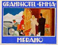
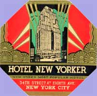
| During
the 1920s, Art Deco found new grounds and flourished with unsuspected vigor
in the United States. After all, was this not an art for the Age of the
Machine, which America symbolized above all others? As far as hotel labels
are concerned, there are tens of American deco designs but few to really
sparkle a choosy collector's interest. Noteworthy exceptions are a series
of octagonal labels, of which one is displayed at left, in which the frames
show unusual designs inspired by deco architectural decorations of the time. |
|
| . |
|
| |
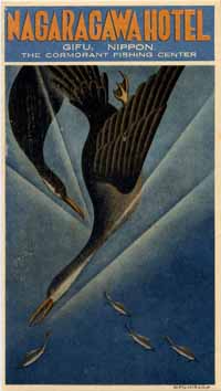
In the end, Deco spread the
world.
In Japan, it drew with unexpected
success from the same forces that fought for the modernization and industrialization
of the country. There is a surprising number of Deco Japanese labels,
of which the example at right is maybe the most extraordinary.
In colonial territories, the
style spread from the modernities of the home country, often through designs
ordered from Europe or by the efforts of one single local designer whose
style was later taken by others. Hotels
in French and Italian N.Africa used a wide variety of Deco labels ordered
from France and Italy; the Dutch East Indies, on the other side, were
also a Deco oasis but mostly through the efforts of local designers of
which the most prolific was Jan Lavies.
|
| |
. |
| 4-
THE LAST DECO LABELS |
|
|
|
|
|
|
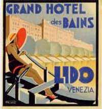
Then as today, modernity clashes
with conservative views and Art Deco never really caught with some people.
Many hotel managers specifically ordered labels made "in the old
style". This was particularly the case for the high-class Palace
Hotels and for other exclusive town hotels- their owners were less willing
to risk on novelties than owners of less pretentious establishments. It
was thus that printers like Richter could survive even though (with very
few exceptions) they did not design Deco labels, while others, like Barabino
& Graeve who probably printed the label for the Grand Hotel des Bains
in the Lido of Venice, practically used exclusively the new style. It
is also for the same reason that Deco labels are more common in vacation
spots than in large towns.
|
|
| |
|
| |
According
to most sources, Art Deco died at the onset of the Second World War. Yet
its attractive styling and modern looks were not really buried and many
hotel labels of the 1940s and 50s can be said to be closer to Deco than
to any other style. This is particularly true of labels designed for hotels
within the Iron Curtain, although the style was, by then, tired and the
designs were not as attractive as they had once been. Yet, and as far as
labels are concerned, in a way Deco lived until the demise of the luggage
label itself. |
| |
|
|
| |
Go
to the index of hotel label pages |
Joao-Manuel
Mimoso |
| |
|
|
|
| .Lisbon,
Portugal |
|
|
|
|
first uploaded
2000-09-05
reviewed 2002-12-20
|
|
|
|