A short history
of hotel luggage labels- 2
The First Golden Age (1900-1920)
by Joao-Manuel
Mimoso
|
|
|
A review of hotel labels
printed in the 1880s and 1890s will leave a first impression of
similarity and, indeed, although the new decade brought improved
graphics and a wider color palette it did not originate truly new
label types.
On the other side, in
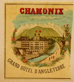
a 1900 travel scrapbook were found two relevant novelties not previously
seen in scrapbooks of the late 1890s. One was a label for a hotel
in Chamonix in which the building was, for the first time, represented
in a fully colored setting that was at least as relevant as the
building itself. This means that the image was purposely done for
the lithographic label, and not adapted from a plate image of the
hotel done for general purposes. This label can be seen at right
and the fact that it looks like just half a label results from the
company having ordered one print for two hotels, each one using
half of the whole.
|
|
|
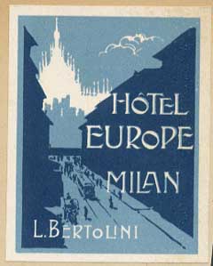
| But the second novelty
is much more important: for the first time a figurative label does
not show the hotel building but rather focuses on a street scene and
includes a local attraction (the cathedral of Milan)- see this label
at right. There is something else new to this label, but we shall
deal with it later, after absorbing the meaning of what has just been
said. The building of a hotel (and particularly that of a town hotel)
is often quite ordinary and the design of the label around it does
not help to convey the feeling of exclusivity that early travelers
were so proud of. On the other side, buildings are difficult subjects
and lengthy to render, as there are many architectural details such
as windows that must be drawn. If travelers want to show off to the
world a mark of the places they visit, then why not design labels
around local attractions, activities or surrounding scenery, much
more open to artistic creativity and easy to design attractively?
Thus was set the scene for the great Golden Age of hotel luggage labels!
|
|
|
| But I mentioned some other
remarkable point about the Italian label above and we should now concentrate
on its colors. The whole scene is represented in blue and black, with
the cathedral silhouetted in white to make sure it would not be missed
(the white parts of a label are often a ground color not covered by
the later inking). The lithographic process requires that another
stone and an extra printing cycle be used for each additional color,
so that these should be kept to a minimum so that the process may
be economically attractive. On the other side, true street colors
are confusing and rather unattractively grayish. How much better would
it be to use an unrealistic palette: only a few colors would be needed
and both towns and scenery could be rendered with a maximum visual
impact. This principle, exemplified at right, was the second spearhead
that launched the Golden Age of hotel labels. |
|
|
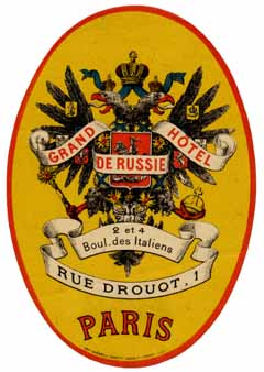
| Label designers did not
invent either the publicity through the use of local attractions,
or the creative use of fancy colors. Both principles had been previously
seen on travel-related posters, particularly of Swiss origin. But
only around 1900 was it realized that the same principles could be
applied to luggage labels and that these could actually be seen as
small posters. The fact that such understanding came slow probably
stems from the fact that, at the time, posters and labels served entirely
different purposes (be reminded that labels served solely the traveler's
vanity and the time when hoteliers would see luggage labels as an
advertisement medium was still to come
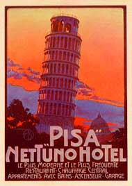
). In a few years the very
same designs (eventually with different lettering) would be used in
both posters and labels, whence the name "poster-labels" applied to
the new brood of stickers. At right you can see a typical poster-label
first issued in the 1910s. |
|
|
|
The new style did not
take the world by storm. A set of 52 hotel labels collected during
an extensive tour of Europe made in 1904 did not include a single
label with the new look! On the other side, another scrapbook from
1910-11 gave a fair number of poster-labels, mostly from Italy and
printed by the Neapolitan firm of Richter & C. After about 1912,
old-style labels become increasingly rarer and probably those few
of a dying breed represent the last remains of old stocks. In the
next few years a succession of wonderful designs emanated from a
select group of printers in Italy, Switzerland, France and elsewhere
who employed gifted graphic artists and vied for a fair share of
the booming market.
Luggage labels were
important items for printers because through them they advertised
their own work to the world and that is why they so often marked
them with their name.
|
|
|
|
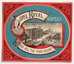
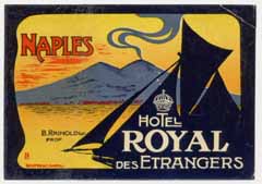
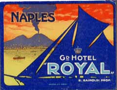
| Compare, above
and below, labels for the same hotel before and after the
graphic revolution that marked the beginning of the Golden Age
of hotel labels. |
|
|
An order of labels from
an important hotel often meant a much larger scope of products than
the labels themselves because the matter of what we now call a graphic
image would come into play. A hotel owner or director might thus
order, from a reputed printer, all the paper items that his establishment
might need, including posters, menus, letter paper, notebooks, bill
books, etc., all sharing the same basic image. Salesmen would visit
hotels in distant towns or countries. The
doings of such a competent and aggressive sales force is testified,
in the case of Richter & C, by their many labels for Egypt and the
Middle East and, particularly, by their labels for Swiss and French
hotels, gaining over printers established locally.
|
|
|
|
In 1914, travel was
booming and the hotel business with it. No passports were needed
throughout Europe, the economy was healthy and spirits were high.
The killing of royalty had become a sort of unfortunate routine
and no one expected one more assassination in an obscure East European
town to start a major war. When it did, everyone expected the war
to be over by the end of the year, but it was not to be
Obviously the history
of the hotel industry shapes that of hotel labels and both depend
on demand. Exquisitely designed hotel labels are often costly and
usually stem either from exclusive hotels, or else from their less
expensive but willing rivals. Then (as today) the expensive hotels
in centers of diplomacy and finance such as Paris, London and Berlin
catered for a much different set of customers than hotels in tourist's
towns like Venice and Naples or winter spots like Nice, Cannes or
Aswan. During the Great War it was business as usual for the large
hotels in capital towns, but the tourist trade all but stopped.
The demand for wintering spots in the warring countries dried, although
some wealthy people that did not contribute to the war effort found
quiet refuges in faraway lands where war was but a distant rumbling.
Hotels in places like Nice were soon put to military use, often
as hospitals for the thousands that were injured at the front. Even
Swiss hoteliers sought some relief from imminent bankruptcy by renting
their establishments to the Allies as supplementary bedding.
|
|
|
| Hotels in Paris have
used labels throughout the war and may even have ordered new labels
made, during that period. So did hotels in countries not involved
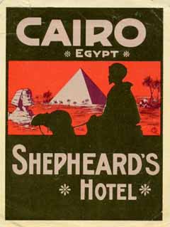
in the war. For instance, Mario Borgoni's 1905 label for the Cairo
Shepheard's Hotel was reissued in 1917. But those hotels that spearheaded
innovation in places like Nice, Grasse or Menton put their label remainders
away in drawers as they gloomily saw the interiors of their Palaces
all but destroyed in the name of the war effort, and wondered whether
there would be a future for their business. When the war ended in
late 1918, the requisitioned Palace hotels were kept in military use
for some months longer. Some did not reopen as hotels, but most finally
did so around 1920, after the plague epidemic that followed the war
had subsided and refurbishments had been concluded. In some cases
the old label stocks were again put to use, in other cases a change
of name of the hotel or a new owner called for some adaptation or
for new labels altogether. When hotels did not reopen or the former
labels could not be reused, bunches of the old stock might find their
way to collectors or dealers. These are the older labels that are
so common today for no apparent reason, while most of the rest of
the same vintage seem to be so very rare. |
|
|
|
Those must have been
hectic days for label printers, after the meager war years when
they had shifted to the printing of patriotic postcards and other
war-related paper items. But it was not a time for innovative designs,
let alone for new styling trends. New labels were often made after
prewar designs for the same hotel. Others were adaptations of prewar
models, like the example at right which you may compare with the
earlier label for the same hotel.
For hotel owners it must
have been a time of uncertainty as no one knew whether the demand
would pick up again. In the end it did, and the crazy twenties were
on. And the Golden Age was rekindled
|
|
|
|
Read
the last part of the Short History of Hotel Labels
|
Lisbon, Portugal
-
uploaded:
Jan. 01, 2003
-
last reviewed:________
|
| |
|
