 |
HOTEL LUGGAGE LABEL ARTISTS 1-MARIO BORGONI by Joao-Manuel Mimoso |
 |
|
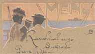
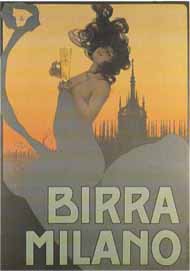
The menu above exemplifies Mario Borgoni's typical Liberty graphics at their very best. The poster opposite, for a brand of beer, shows Borgoni's sense of proportion and easy rendering of the human form. It is said to be his best such work. |
Art Nouveau in its graphic form was introduced to Italy in 1895, where it became known as Liberty Style (after the name of the London departmental store famed for its contemporary designs).
Mario Borgoni, a young Italian artist who had been born in 1869 in Pesaro (on the eastern coast of Italy) and studied at the Neapolitan Art Institute, where he later taught Ornament for many years, was an early practitioner of the fresh new style. As his pairs at the then revolutionary Italian Liberty Movement he had such gifted graphic artists as Giovanni Mataloni and, especially, the German immigrant Adolfo Hohenstein.
 |
|
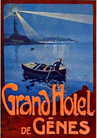
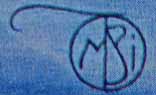
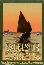
Above, Borgoni graphics with the typical two-plane image. The representation of boats in the water is one of the artist's most recurring themes. Below, Mario Borgoni's monogram.The position of the arabesque is variable. |
 |
Around 1900 he started freelancing for the Neapolitan printer Richter & C, becoming its artistic director around 1906. In his posters for Richter, Borgoni often used a particular Liberty design solution by which he separated the image in two parts: i) a sort of dark cursive frame in the foreground, that often included the lettering and, at times, an observer; and ii) a scene as viewed from the window thus formed.
That style, as applied to hotel labels by him or other artists under his direction, became a sort of trademark of Richter & C that was widely imitated and upon which rested the company's worldwide success as a supplier of labels to the hotel trade.
Mario Borgoni made a career as a bona-fide artist and painter-decorator, but experts say that his art lacks depth. Whatever they may mean by that, it is undeniable that he was a superior draughtsman of the human figure and is justly remembered for his sensuous treatment of women in some of his best poster work. He has probably designed many labels early in his career but soon he concentrated on posters, some of which were reduced for use as labels. These often carry his monogram (the letters "Mbi" in a circle).
 |
|
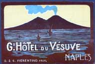
The image above (click it) may well represent one of the earliest examples of Mario Borgoni's style in hotel labels. The characteristic window is present but the proper way to represent the sea at this small scale had not been properly worked out yet. The varnish was applied manually.Unsigned, early 1900s The label below, unsigned but certainly by M.Borgoni, illustrates his fully developed style, up to the complex treatment of the sky. |
 |
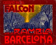 |
| This label for a Spanish hotel (click it for a larger view) demonstrates Borgoni's versatility. His simplified rendering of the busy Rambla, the contrast of colors and the effective lettering combine with quite amazing results. |
There is some indication that, non-withstanding his talent, Borgoni did not consider himself a true artist, possibly because so much of his work was graphic: in 1916, when Enrico Gianelli did a compilation of biographical notes on Neapolitan artists, Borgoni left unanswered a request for data on himself, which Gianelli attributed to an excess of modesty but more likely stemmed from a lack of self esteem for his own work.
Another clue to his feelings can be found in the fact that, unlike other artists, he often did not sign his poster work. It is likely that his few known signed labels were originally designed as posters and then reduced for use as labels.
| A Borgoni label printed after a poster by the 3-color process. |
 |
In 1930 Borgoni left Italy for the United States where (at 61!) he started a new career as publicity and fashion illustrator. He returned in 1936 to die in Naples, where he had worked for most of his life.
Borgoni's main contributions to hotel label art were the double-plane style, the elegant Liberty lettering and his "degradee" treatment of the early morning or evening skies. The proper lithographic rendering of his reds or oranges softly fading into yellows requires a high level of workmanship and its widespread use in hotel labels is characteristic of Richter alone.
|
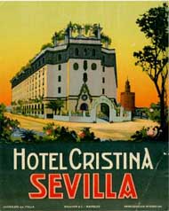
One of the most endearing and easily recognizable aspects of Mario Borgoni's superb designs was his treatment of the early morning or late afternoon skies, often with a moon, as exemplified by the label above, lithographically printed after a poster, around 1912; and by the label below. The Hotel Cristina opened for the 1929 Exhibition in Seville and this was its second label. Albeit unsigned, Borgoni's style is unmistakable and shines through at a time when Richter's new designs were a pale makeshift of the marvelous labels of 20 years before. This may well have been Borgoni's very last label for Richter. |
 |
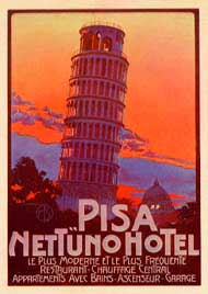
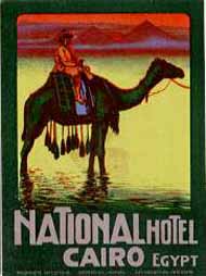
Mario Borgoni was and remained primarily a poster artist. The fact that most (if not all) of his known (signed) labels are scaled-down posters is apparent: Borgoni's treatment of detail and light in the large lithographic posters is often impossible to render accurately, by the same technique, at the reduced scale of a label. So, several of his labels were either reproduced photographically from posters and printed by the 3-color process (which lowers considerably their interest and value), or else they were lithographed at the cost of a noticeable loss in graphic quality. For labels printed by the 3-color process, examine that of the Nettuno Hotel in Pisa (above, far right) and that of the National Hotel at the top right side. Compare this label with the same design on a later lithography.
Yet his influence was decisive at the onset of the First Golden Age of hotel labels. His style was the artistic pillar of Richter's success, and the ubiquity of Richter's labels made of Borgoni's style the standard by which all others would be measured.
Borgoni himself never adapted to the modernistic deco trends and Richter was at a stylistic dead-end by the time he left. But even so, he remains the most influential hotel label artist. Actually, the only one without whom the history of this field would certainly have been different.
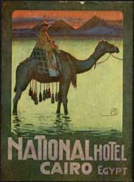 |
| Above, label photographically reproduced from a Borgoni poster and, below, later lithography of the same design. Notice the limitations imposed by the lithographic process. |
 |