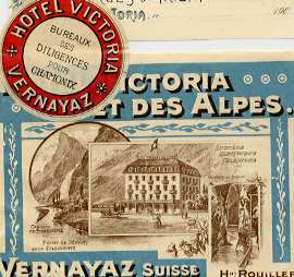
What looks like a hotel label but is not one...
by Joao-Manuel Mimoso
LETTER SEALS
An old habit that, in Europe, persisted until the first quarter of the XX century was that of sealing letters with lacquer. People would heat a stick of lacquer in a flame, then touch the envelope with the melting stick so as to deposit a portion exactly where the flaps meet, and finally press their personal seal against the hot lacquer. Letters were thus closed in a way that supposedly ensured privacy since anyone wanting to read them had either to cut the envelope or break the seal.
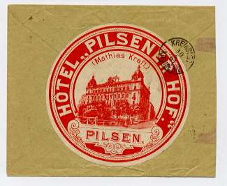
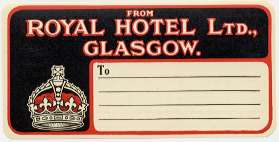
This rather messy procedure was not compatible with the practicalities of a hotel stay and so hotels provided small labels for guests to use instead of lacquer seals. At right compare the label and seal for an European hotel.
Around 1900 all the major European hotels used letter seals but they seemingly started falling from favor before WW1 and had practically disappeared by the late 1920s.
Letter seals look like small labels, are often round with a diameter of less than 6 cm, and typically do not share the design of the luggage label, having a round or elliptical shape and a simple design centered on the name of the hotel.
When the hotel did not have a seal, labels might be used for the same purpose, as on the example at right.
Luggage labels had to be obtained from porters. Letter seals, on the other side, were (presumably) freely available to guests at the writing rooms of hotels. Wiser hotel owners would not want them to be excessively attractive lest they be taken by the handful by souvenir-seeking guests. Still, they are relatively common and are collector's items on their own right and an interesting complement to a collection of luggage labels. But they are NOT themselves a part of the group.
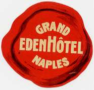
However, larger seals (like the one at right which imitates a lacquer blotch) have almost certainly been pasted on to pieces of luggage as if they were actual labels and the boundary between the two may indeed be blotchy....
LUGGAGE TAGS
Those of you who travel often, and particularly those who have arrived in the early morning to upper class hotels, may have noticed that the luggage was tagged on arrival with your name so that it might, later, be left in your not yet ready room. Such tags existed at least from the early years of the XX century particularly as hotels were then often responsible to carry one's luggage from and to a train station or ship dock. Tags are not luggage labels, although, as in seals, there is a family tie often revealed by their graphics.
In several countries, and particularly in English-speaking countries and colonies, tags and labels were often combined into particular types of labels with areas for the writing of the guest's name or that of his outgoing ship. These are true hotel luggage labels.
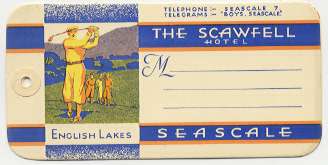
There were also mail labels used to write the address of outgoing mail- example at right. In the United States these were particularly elaborate, often sharing the graphics of labels but are not to be confused with them.
COLOR XEROXES AND SCANS (privately made)
Labels have been reproduced
for a number of reasons as color Xeroxes or prints of scanned images.
I myself use them, as reference and for research purposes, and frequently
display them side by side with authentic labels. These reproductions may
not be easy to detect particularly when made after non lithographic labels.
Yet they all share the same characteristic: being made with a technology
that scans the image in lines, under magnification they resolve into lines.
Modern computer printers of superior quality have a zigzagging feature
that tries to superimpose and mesh the lines. Still the lines should be
apparent under magnification, particularly in the less dark areas! Also,
since all colors in a print are made from a relatively small number of
ink colors, a close observation of very light colored areas (again under
magnification) always reveals some darker pixels with which the printer
"tries" to duplicate the exact shade of the original.
The 1988 book "Luggage Labels" was illustrated with one hundred hotel
labels reproduced without any size reduction. This was an unfortunate
option: whenever I see privately made reproductions being passed as originals
(often sticked to old trunks as if they were testimonies of travels of
long ago) they are invariably taken from this book!
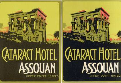
At top right are a much reduced label and its Xerox copy. At right both borders magnified 10 times. The original, at left, shows a compact color -the slight blotching is typical of the lithographic process; on the other side, the copy resolves into the lines in which the image was scanned by the copier...
|
|
 |
REPRODUCTIONS (commercially printed)
Copies of existing labels have been printed commercially a number of times in the past, in several countries and for a number of reasons. They were invariably reproduced photographically from the originals and printed by the so-called four color process. When observed under magnification the prints resolve into dots, unlike the original labels which were usually lithographic and are thus made of areas of compact, pure colors (but see the final chapter in this article for exceptions). The paper is also of a different quality, the prints are often poorly made and the colors are not faithful to the originals.
Recent copies are self-adhesive and easily detectable unless they are already pasted on to a backing paper and framed for display. Readers are cautioned against buying such displays as being of original labels. One such set of reproductions of very desirable Asian labels was printed in Singapore and is sold at the Raffles shop.
The most problematic reproductions to identify, particularly when they occur singly, are those made and sold in sets as curiosities. Lithographic labels were expensive to produce and the process allows only the printing of a limited number of copies before the stone gets saturated with ink and the prints become too dark. So, in the Golden Age of Travel, labels were produced in batches of just a few thousand copies at a time and hotel managers could not afford to offer or even sell labels by the hundred to whoever might be interested in marketing them. At the most, a good tip to a porter or bellboy might loosen a few dozen labels from the stock. Dealers wanting to sell labels to collectors would satisfy themselves with that, but people wanting to sell labels in numbers as novelties or luggage decorations would have to print them by reproducing existing labels.
Read the following text published in 1936 in the magazine "Atlantic" and available elsewhere in the Net: "The term (agnostic) is so regularly used to imply a negative certainty that its value as a label, a distinguishing mark, is false and misleading. It is like the hotel labels which unscrupulous tourists in Paris buy by the dozen and stick on their luggage as evidence that they have visited places where they have never been, and put up at hotels which they have never seen." So, as you see, the selling of luggage label reproductions was not only a fact but also common enough to be used as part of an argument. Besides this reference, I have seen such reproductions mentioned in association with international fairs in the United States in the 1930s but they were also undoubtedly printed and sold in other countries and at other periods of time.
Such reproductions are old (I have obtained a few examples from collections that were put together 50 years ago) and at times look misleadingly older, but there are five telltale characteristics that do not necessarily occur together but should nevertheless help identify them and that I shall now resume:
- the prints are made by the 4 color process and resolve into spots;
- the prints are cheaply made and the colors are often not correctly superimposed resulting in a sort of "out-of-focus" effect;
- the paper looks unusual for a label and sometimes feels peculiarly velvety to the touch;
- no name of printer is present (the printer's mark was removed from the originals, sometimes by cutting part of the original off, to avoid legal action by printers seeing their brand name associated with inferior products); and
- a whitish margin is usually present because labels were printed at a certain distance from each other and it was left to the buyer to trim the margins (this margin may, of course, have been cut off by a previous owner).
 |
 |
|
Far top, the original label. Near top, a commercially printed reproduction, made for selling as tourist's souvenirs sometime before the Second World War. |
LABELS THAT LOOK PHONY BUT ARE NOT
Labels printed from photographs were in use before 1900, so there are many, many authentic luggage labels that resolve into dots under magnification. Whenever photos, or much detailed line originals, or paintings with a fine and detailed use of color were used as basis, the non lithographic process was often preferred. Such labels show dots under magnification. A good example are the twelve or so labels signed "Dan Sweeney" that were printed circa 1929 by a four-color process. In this case lithography could not be used to render the fine detail of the originals. In this case the screens used in the process were rotated by a 15º angle from one to the next (to avoid superposition of the printed dots) giving the prints a rosette pattern that is very characteristic and will be evident under the eyeglass.
Additionally, many hotel owners ordered local reproductions of fine earlier lithographic labels. Often these were reproduced with photography and the prints show the dots although the labels are unquestionably original.
Finally, and contrary to what some people who write to me seem to think, I do not know everything in this domain and often have doubts myself. When in doubt I always take a label to be authentic... I advise you to do the same!
 |
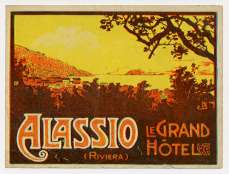
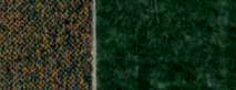 |
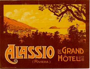
At the right far top Mario Borgoni's fine rendering of the morning sky (printed lithographically in a poster that was perhaps four feet long) was impossible to reproduce faithfully at the label scale, except by photographic means. That was the solution used in the pre-WW I issue at left, while at its right is the same design as issued by the lithographic process in the 1920s with much worse results. The scan below the two labels compares both borders at 10X magnification.
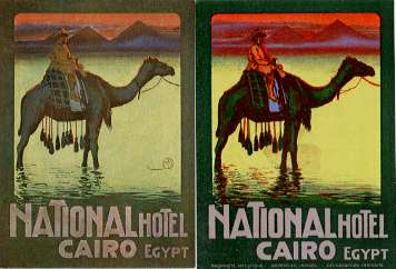
The superb authentic label at the immediate right (an early Richter design) combines a lithographic frame with a photo printing of the hotel that resolves into dots.
go to the index of hotel label pages
-
uploaded Feb17,2002
-
reviewed Dec05,2002