A wise man once said that imitation was the sincerest form of flattery. As luggage labels are concerned, there was a lot of flattery going around!
I am not interested in thematic collecting but if I was, I would certainly seek pairs of labels that exemplify imitation in the field, because the subject is fascinating. And they abound!
In the early XX century, graphism could not often be protected by copyright. The owner of a hotel would thus rightfully consider himself the master of any design produced for his establishment and could order new copies from any printer that he chose. Of the same label may thus be found editions by, say, Richter and Trüb. Such cases can not be classified as imitations.
Other pseudo-imitations are labels for groups of hotels that share the same basic design, and generics (standard designs sold from a catalogue).
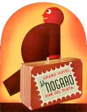
The imitation may apply to just one part of the original design (a figure, say), or it may simply result from the using of the same general idea of the mimicked label but with altogether different graphics, like in the example at right, involving the remarkable deco-label for the Nogaro chain of hotels.
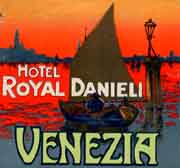
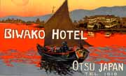
In a few instances both the general design and one of its elements are used in the new label, as was the case of the Biwako Hotel which in 1938 drew inspiration from the much earlier Richter label for the Venice Royal Danieli which, at the time, had already been superseded by another version,
Sometimes the graphic designer to whom a label was commissioned will follow the pattern of some other label that he has seen. Then, the owner of the hotel may not be aware that his labels are not altogether original. Yet, such cases cannot be singled today and must thus be considered included in the same group mentioned above.
This type of mimicking is flattering and usually occurs between hotels that are far apart from each other.
The second type of imitation occurs when the same printer adopts the same basic "template" to different designs for different hotels.
These cases are much rarer but may be extremely interesting, particularly when the template refers to only some particulars of the design (like the frame) while some capital traits are kept specific. In such cases the labels are different but there is an undeniable family resemblance that does not reflect any actual relation between the hotels.
Finally there is a third type of imitation (the rarest of all) that occurs between neighboring hotels. Typically one of the hotels is reputed for quality of service and the other tries to emulate the graphics as if that might, by some sort of black magic, bring home some of the clientele of the better hotel.
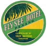
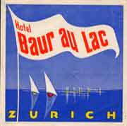
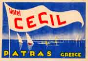
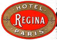
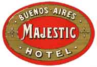
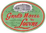
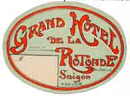
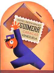
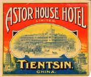
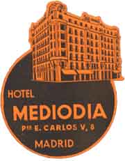
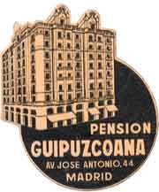
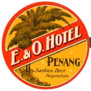
The pairs of labels in this page exemplify the three cases mentioned. Have fun discussing which are what...